Logistic Regression is one of the machine learning(ML) used for solving classification problems. It is used to predict the result of a categorical dependent variable based on one or more continuous or categorical independent variables. I have summarized Its basic principle in one blog (https://www.bioinfo-scrounger.com/archives/750/) referring to the book of "Statistical Learning Method".
As we known, logistic regression can be applied in the different aspects, like:
- Calculate OR value to find out potential risk factors.
- Construct a model as a classifier to estimate probability whether an instance belongs to a class or not.
- Adjust potential mixed factors so that we estimate the impact of the interested factor and endpoint.
For example:
Suppose we’re interested in know how variables, such as age, sex, body mass index affect blood pressure. In this case maybe body mass index is my most interested factors, and the age and sex are mixed factors. Therefore the blood pressure should be categorical variables, split into two-factors, high blood pressure and normal blood pressure.
In my case, I have a known biomarker as a reference marker, and I’d like to add another marker to the refer one as a marker combination. Then estimate whether the marker combination is better than the reference marker. So how to select the appropriate statistical methods?
Obviously, the most straightforward idea is to compare the sensitivity and specificity between the combined marker and the reference marker.
- Superiority of sensitivity, the alternative hypothesis is that the number of the additional cancer cases identified by combined marker to reference marker is larger than zero. The p-value is calculated by a binomial test.
- Non-inferiority of specificity, the alternative hypothesis is that the number of misclassifications as positive by combined marker is less than 10% relative to reference. The p-value is calculated using an approximated standard normal distribution based on the restricted maximum likelihood estimation(RMLE).
However if you want to compare the AUC between the reference marker and combined marker, a logistic regression can meet our needs perfectly. So reference marker and combined marker as the independent variables and the disease condition (cancer/control) as the dependent variable. We’re pleased to see that the combined AUC is larger than the reference one.
Before we perform logistic regression, some details may be useful to our model and worth considering in advance.
- Remove potential outliers
- Make sure that the predictor variables are normally distributed. If not, you can use log, root, Box-Cox transformation.
- Remove highly correlated predictors to minimize overfitting. The presence of highly correlated predictors might lead to an unstable model solution. The third consideration is always neglected in our performance.
In that way, how to fit a logistic regression model and calculate the AUC? I'd like to take a little notes about the analysis process in R and SAS. By the way, I think R is much better than SAS in the statistical analysis and visualization aspects. This is the spirit and power of open-source, which makes our work better and better.
I take the data set PimaIndiansDiabetes2 from the mlbench package as an example, which is about “Pima Indians Diabetes Database”. Load the data, select two interested variables and response, remove NAs.
library(tidyverse)
data("PimaIndiansDiabetes2", package = "mlbench")
data <- select(PimaIndiansDiabetes2, c("glucose", "pressure", "diabetes")) %>%
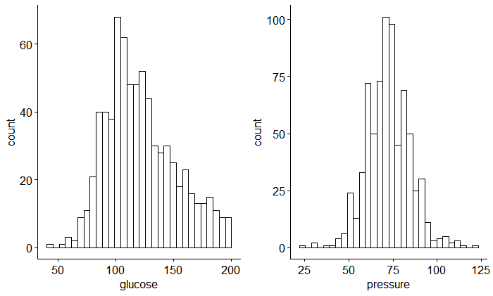
na.omit()Firstly I think it’s necessary to estimate the distribution and correlation between those variables (glucose and pressure) as follow:
## distribution
ggpubr::ggarrange(
  ggpubr::gghistogram(data = data, x = "glucose"),
  ggpubr::gghistogram(data = data, x = "pressure"),
  nrow = 1, ncol = 2
)
## correlation
library(ggcorrplot)
ggcorrplot(corr = cor_pmat(PimaIndiansDiabetes2[,1:8]), method = "circle")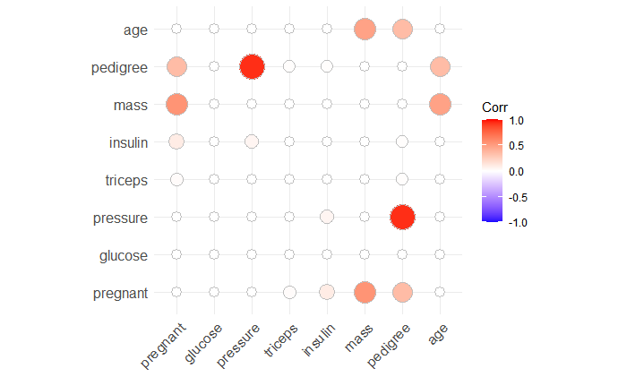
Here, we can see that these two variables are normally distributed and without correlation.
Then I fit a simple model based on the glucose predictor variable.
model1 <- glm(diabetes ~ glucose, data = data, family = binomial)
summary(model1)$coef

##                Estimate  Std. Error   z value     Pr(>|z|)
## (Intercept) -5.61173171 0.442288629 -12.68794 6.897596e-37
## glucose      0.03951014 0.003397783  11.62821 2.962420e-31
The output above shows the beta coefficients and according significance levels. The intercept is -5.61 and the coefficient of glucose variable is 0.039. Moreover, Std.Error represents the accuracy of the coefficient, the larger it is, the less confident it will be. And the z value is the estimation value divided by standard error, and according to the p-value.
When we think of the Hazard Ratio, maybe we should know the meaning of logistic beta coefficients. We know that estimate is the regression coefficient, so exp(coef) is the odds ratio which means the ratio of the odds that an event will occur (event = 1) given the presence of the predictor x (x = 1), compared to the odds of the event occurring in the absence of that predictor (x = 0)
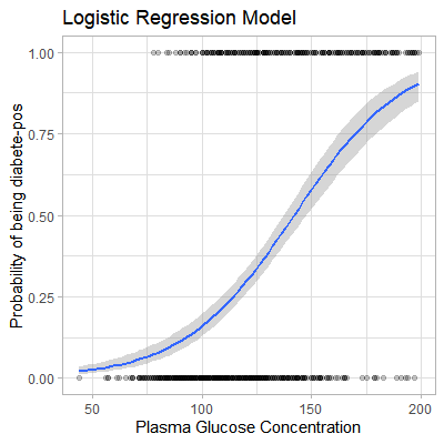
We all know that the s-shape curve is defined as p = exp(y) / [1 + exp(y)] (James et al. 2014). This can be also simply written as p = 1 / [1 + exp(-y)], where:
y = b0 + b1*xexp()is the exponentialpis the probability of an event to occur (1) given x. Mathematically, this is written asp(event=1|x)and abbreviated asp(x), sop(x) = 1 / [1 + exp(-(b0 + b1*x))]
Based on the formula, if we get a new glucose plasma concentration, it will be easy to predict the probability of the patient being diabetes positive. In R, we can use the predict() function to calculate the probability instead of that logistic equation.
mod_prob1 <- predict(model1, newdata = data, type = "response")We can also apply geom_smooth() to fit a s-shaped probability curve using the above data.
data %>%
  mutate(prob = ifelse(diabetes == "pos", 1, 0)) %>%
  ggplot(aes(glucose, prob)) +
  geom_point(alpha = 0.2) +
  geom_smooth(method = "glm", method.args = list(family = "binomial")) +
  theme_light() +
  labs(
    title = "Logistic Regression Model",
    x = "Plasma Glucose Concentration",
    y = "Probability of being diabete-pos"
  )
Back to my case, my purpose is to compare the reference marker and combined marker. Suppose the glucose is the reference one, the glucose plus pressure is the combined one. So I must fit multiple logistic regression with glucose and pressure variables.
model2 <- glm(diabetes ~ glucose + pressure, data = data, family = binomial)
summary(model2)$coef

##                Estimate  Std. Error   z value     Pr(>|z|)
## (Intercept) -6.49941142 0.659445793 -9.855869 6.465488e-23
## glucose      0.03836257 0.003428241 11.190160 4.556103e-29
## pressure     0.01406869 0.007478525  1.881212 5.994305e-02
In the same way, calculate the probability based on the multiple regression. And then compare the two models with AUC.
mod_prob2 <- predict(model2, newdata = data, type = "response")

plotres <- data.frame(event = ifelse(data$diabetes == "pos", 1, 0), glucose = mod_prob1,
                      pressure = mod_prob2, stringsAsFactors = F) %>%
  pivot_longer(cols = 2:3)
To plot multiple ROC curves on the same plot, maybe plotROC package can help us, perfect to use.
library(plotROC)
p <- ggplot(as.data.frame(plotres), aes(d = event, m = value, color = name)) +
  geom_roc(n.cuts = 0) + style_roc()
p + annotate("text", x = .75, y = .25,
             label = paste(c("glucose", "pressure"), "AUC =", round(calc_auc(p)$AUC, 4), collapse = "\n"))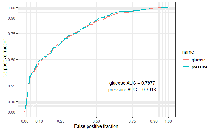
From this roc output, maybe the “combined marker” is not better than “reference marker”. Obviously, it’s my fault to choose a non suitable dummy data. But I think this blog is useful to understand what the logistic regression in biomarker combinations is.
Thanks for this article( Logistic Regression Essentials in R ) to make me more clear about the logistic regression.
Reference
Logistic Regression Essentials in R Heart Disease Prediction using Logistic Regression
Heart Disease Prediction
Understanding Logistic Regression using R
Chapter 10 Logistic Regression
Generate ROC Curve Charts for Print and Interactive Use
Please indicate the source: http://www.bioinfo-scrounger.com